Wednesday, 26 September 2018

//BTEC// Questionaire


                                                                                               Place ticks next to preferred answer

1. What should the genre of my Film magazine be?                            

Action
Horror
Comedy
Romance
Sci-Fi

2. At what price should the magazine be set?

£1
£2
£3

3. What should the house style be (Preferred manner of representation and layout)?

Clean
Messy
Packed
Spacious

4. Colour Palette to be used?

Blue and Yellow
Red and Green
Purple and Orange

5. Should a puff (Free gift or entrance to competition for prize or QR Code) be included?

Yes
No

6. What Typography should be used?

Sans - Serif
Serif
Impact-Type-Font

7. Should there be a Seasonal Theme?

Yes
No

8. ^If yes choose which one below

Summer
Autumn
Winter
Spring

9. How should the magazine present itself to you?

Informative
Educational
Entertaining

10. If You check all your answers above and put them together would you buy that magazine?

Yes
No

Tuesday, 25 September 2018

//A LEVEL// INDUCTION:Written Task


GQ Magazine, 

Target Audience: Teens-Middle aged men

The main image presented is of the star vehicle, male celebrity David Beckham.  Mise en scene presents David wearing a smart black suit, white shirt and slim black tie. This has symbolic codes of professionalism and is the average outfit of a stereotypical man who works in a high-end office job. This reinforces stereotypes of men, telling the audience that this is what an ideal man looks like. In addition, mise en scene shows him wearing a wedding ring, meaning he’s a married man who most likely goes out to work for his family and “put food on the table”.  Mise en scene shows a mid-shot being used for David, to show not his full posture but what most people would notice of a man. From their head to their waste a man can be judged, and by showing us this, we as the audience see David, the star vehicle, overall as a smartly dressed, hard workingman. Moreover, Mise en scene presents David with tattoos, which tells the audience that underneath the suit is a man, rugged and rule breaking, reinforcing stereotypes of men also. He uses direct address, which connotes bravery and a confident attitude. This works hand in hand with his slight smiling expression.  This is a progressive stereotype, helping men to seem better than most actually may be. There is a pull quote in the far left of the page, saying “Style Bible”. This idolises mean in a godly way, as the authors of this “style bible” are men. And the author of the original bible is god. This isn’t a popular stereotype however it has symbolic codes of women idolising men as creators. This also works with god having been a male. The typography for the masthead is sans serif, connoting neatness and cleanliness. This subverts stereotypes of men, as they are mostly known to be messy and un-hygienic. The gesture of the star vehicle is holding their jacket together, almost attempting to stop anything from inside coming out. This has connotations of men hiding their true selves and their feelings from others to maintain a certain image towards others. This stereotype is regressive, presenting men as shy and eager to hide things from other people. 

//A LEVEL// MUSIC Video General Analysis: Drake: How he's presented outside of Music Videos within Media

On this document, I will be discussing different aspects of music videos. These aspects will be Purpose, Style, Representations, Editing, Moving Image Codes, Visual Codes, Key Terms and audio, in this order. The Music Video I will be referencing for this is " Drake-Nice For What" //www.youtube.com/watch?v=U9BwWKXjVaI


 Purpose:
The purpose of a music video is when a music video was made for a certain reason, such as the promotion of an actual song or a whole album. For example, in Nice For What, it was a promotion for a single, then due to it's popularity, became a promotion for Drake's album Scorpion, along with his other flagship song "In my Feelings".


Style:
 The type of approach and run the whole music video has, from beginning to end. There are three different possible styles. Thematic, where the video focuses on different themes, and may use satire humour to get it's points across. A lot of the time it will discuss controversial issues. Performance, where the artist will place focus on themselves and possibly others, showing of their skills, maybe dancing, drawing, a certain hobby. Narrative, where the music video appears to have some sort of story to follow from beginning to end. Only thing is, it's sung instead of read. For Nice for What, I think the style is a mix of Performance and Thematic. I will explain why later on.

Representations:
This is an important part of the music video. This is what the music video wants to send as a message to audience. What are they talking about and why. Like gender, ethnicity, national identity or age. Or all of them at once like "This is America" by Childish Gambino. In Nice For What, Representations of Gender and ethnicity are touched upon. The majority gender shown in the video are women. Not as much through a male gaze as it is showing women appreciating themselves for their looks, and features This Connotes confidence within women. In addition, ethnicity is shown massively, as their is an actor for each ethnicity. This connotes Drake as a multi-culturist, and drake giving his point of view that people from all races should be appreciated. I feel like National Identity is not touched upon.

Moving Image Codes:
Drake has used a wide variety of different camera shots in his video. There is a full range of close ups, mid shots and long shots throughout the video. And all the different models receive at least one of each. I think this backs up my earlier point, showing he wants all women to have the same treatment, and that neither of them should be appreciated less or more than the other. The angles stay mainly mid way, looking at the models directly. However towards 2:26, camera movement becomes prominent. Panning, whilst on a close shot. This shows them profiling the different models. Almost like scanning their faces. This connects to my earlier point because when scanning something, like a fingerprint, it's always unique and there's not another thumb you can scan which will be exactly the same. This represents women as unique again. The only zooms I noticed were towards the end of the video, around 3:20 to the very end. The first one being a zoom out of another women, however she's not presented the same. When you finally hit a long shot on this women, you see that she is meditating. This actually presents her physically on a higher level to the rest of the women in the video, juxtaposing my earlier point. Although this could be drake saying to the viewers of this video that by the time they reach the end (mainly the women) they will be 'mentally and emotionally' higher than they've ever been. As for editing, the video cuts to the beat throughout, and the pace stays the same.

Audio:
The lyrics for the song can be found at https://www.google.co.uk/search q=nice+for+what+lyrics&rlz=1C5CHFA_enGB815GB815&oq=Nice+for+what+lyrics&aqs=chrome.0.0l6.5247j0j7&sourceid=chrome&ie=UTF-8. The chorus speaks from what seems to be a womans perspective. They repeat, "you said you'd care for me", "you said you'd die for me" and "why won't you live for me". I don't think this is directed at Drake, but instead at the different men that the women had relationships with. This presents the expectations women have on men, and what they think they should be willing to offer when in a relationship. This is effective on the female audience. Strongly on feminists, as women show themselves to be dependent on men within the video. As for men, they would most likely also take offense to this. It's a stereotype that men constantly don't give women what they want and need, and it would be regressive for men when being presented in this video. However clearly Drake's focus is on appreciation of women and not his own gender throughout the video and lyrics. We see
//A LEVEL// All About Me Video


Wednesday, 19 September 2018

//BTEC// Initial Research For a new Film Magazine

Initial Research For a new Film Magazine
Image result for total film magazine september 2018
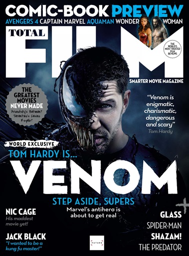
The magazine i'm using is Total Film, from September 2018, Issue 276. This magazine sports a main image of Tom Hardy, the Star vehicle of his latest movie, Venom. Secondary research is used to check that your primary research is correct and is used save time. It involves using information that others have gathered through primary research. The Cover of this magazine makes the genre seem like horror, since the movie used contains a horror aspect to it. The cover page includes a graphic feature, saying "The Greatest Movies Never Made". The Masthead Total Film along with the Main Cover line Venom. The Star vehicle is Tom Hardy, in his Venom suit and persona. Cinematography shows a close up of the star vehicle, to better draw the audience's attention towards their face. The Colour palette consists of Dark and Royal Blue, White, Grey and Black. The teeth shown on the star vehicle supports the iconography of this magazine having a horror genre, for this issue, as the teeth are long and sharp. The Front Cover also matches a seasonal theme as the colours used on the colour palette are winter inspired, and this issue was published in september. Underneath this text is the contents page, mixed with a double/centre page spread. The Film hasn't hit the theatres yet so there is no Film Review on Venom however there is brief input from the audience that speak their opinion on a variety of different movies, like Shazam and the latest Die Hard. There is a contest for readers, and those who enter and win will receive a free issue of the next magazine, and a gift card.  Along with the double page spread contents page, is another Cover for a different film magazine, located above this text. It's called So Film Issue 20. Both of these covers share the masthead located to towards the top of the page. They both use a Star vehicle to drive the magazine forward. However the So Film magazine has a very different seasonal theme. It shouts more autumn or spring, because Mise en scene depicts the star vehicle, Gerard Depardieu wearing a leather jacket.  Also, the colour palette is a lot lighter than the Total Film one, giving it more of a drama/documentary feel, instead of a horror (Fictional). The colour palette consists of the colours Yellow, and white, contrasting the previous ones from Total Film. There are a lot less cover lines placed on this Front cover, and more headlines, underneath each other, giving it a neater house style.                                                                

Wednesday, 12 September 2018

//BTEC//All About Me

My Hobbies:
  • In my spare time, first of I like to visit the gym, around 2 to 3 times a week. I have not yet signed up for the gym in enrichment but I plan to. 
  • I am an athlete, training at croydon arena every other saturday for 100M, and long jump, despite my size. 
  • I play guitar but not professionally, just for fun, and I also play my PS4 every now and then. 
  • Watching Movies and drawing are also two of my hobbies, of which inspired me to want to take media and graphics in college.
Brothers Or Sisters:
  • I have one half sister, one half brother and one full sister, giving me 3 siblings. Their names are Marsha, Daniel and Andrea. I'm the youngest out of all of them. 
PT job:

  • During Summer I was working with my dad doing labouring, bricklaying and building. Now summers finished I plan to either work with him part time, or catch a job at McDonalds part time or on saturdays. 

Post Modernism in Life On Mars

Post Modernism is very prominent within the text Life On Mars. intertextuality makes an appearance in the text. It's a massive link to D...