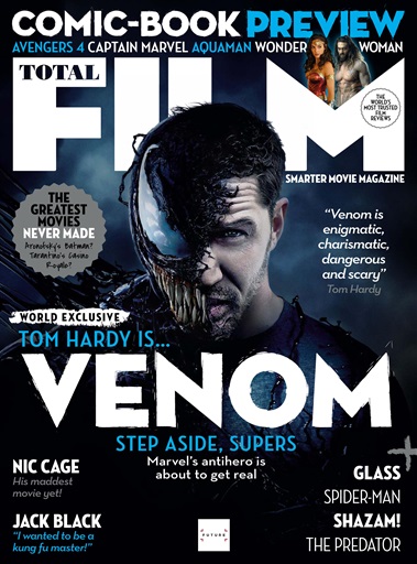

 The magazine i'm using is Total Film, from September 2018, Issue 276. This magazine sports a main image of Tom Hardy, the Star vehicle of his latest movie, Venom. Secondary research is used to check that your primary research is correct and is used save time. It involves using information that others have gathered through primary research. The Cover of this magazine makes the genre seem like horror, since the movie used contains a horror aspect to it. The cover page includes a graphic feature, saying "The Greatest Movies Never Made". The Masthead Total Film along with the Main Cover line Venom. The Star vehicle is Tom Hardy, in his Venom suit and persona. Cinematography shows a close up of the star vehicle, to better draw the audience's attention towards their face. The Colour palette consists of Dark and Royal Blue, White, Grey and Black. The teeth shown on the star vehicle supports the iconography of this magazine having a horror genre, for this issue, as the teeth are long and sharp. The Front Cover also matches a seasonal theme as the colours used on the colour palette are winter inspired, and this issue was published in september. Underneath this text is the contents page, mixed with a double/centre page spread. The Film hasn't hit the theatres yet so there is no Film Review on Venom however there is brief input from the audience that speak their opinion on a variety of different movies, like Shazam and the latest Die Hard. There is a contest for readers, and those who enter and win will receive a free issue of the next magazine, and a gift card. Along with the double page spread contents page, is another Cover for a different film magazine, located above this text. It's called So Film Issue 20. Both of these covers share the masthead located to towards the top of the page. They both use a Star vehicle to drive the magazine forward. However the So Film magazine has a very different seasonal theme. It shouts more autumn or spring, because Mise en scene depicts the star vehicle, Gerard Depardieu wearing a leather jacket. Also, the colour palette is a lot lighter than the Total Film one, giving it more of a drama/documentary feel, instead of a horror (Fictional). The colour palette consists of the colours Yellow, and white, contrasting the previous ones from Total Film. There are a lot less cover lines placed on this Front cover, and more headlines, underneath each other, giving it a neater house style.
No comments:
Post a Comment