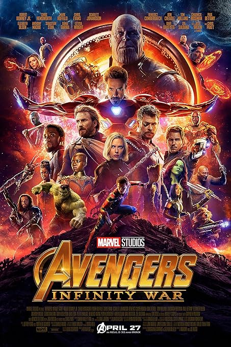
 The Movie I will be analysing for their poster and trailer will be Avengers:Infinity War.
The layout of the poster portrays the cast of the film spread out across the vertical page. The design consists of an area placement, most likely a place the cast will visit whilst in the film. The lighting is quite bright in some places, likely because of the pure light generated by the characters themselves, such as Iron Man and his blue repulsers, or the antagonist, Thanos, with his glowing infinity stones.
The colours used are very rich, however again, the poster is majorly taken up by the characters and their properties. The background though, consists of the colours purple and gold. This has connotations of dietes, and an idea of the kind of high tier levels of people, that the film will be dealing with. Avengers is a popular title amongst the marvel community, therefore, the font used for the capital "A" is the same in all media it's represented in and it's iconic. For those who are familiar with the series, they would already understand the genre, however through the use of mise en scene, we see weaponry and suits shown and presented, hinting to the audience that it is in fact an action movie. In addition, not one person on the poster is wearing a smile, possibly making a link to something bad within the atmosphere.
The visual codes of this poster take a similar approach to that of LucasFilms Star Wars posters and promotions. This is effective as a frequent place visited within the new avengers film is space, and of course, star wars is based majorly in space, so this was an easy comparative. This marks quality, along with the presentation of the very popular "Marvel Studios" logo. If your eyes are good, you will notice actors such as Robert Downey Jr, Chris Hemsworth, Scarlet Johanson and Benedict Cumberbatch. However they're not mentioned through anchorage, but instead, placed further towards the front, to draw in more of the audience, and consume the majority of concentration upon them.
Mise en scene presents only two characters majorly gifting direct mode of address towards the audience. This two characters are, Iron Man and Thanos, almost the two main protagonists and antagonists within the film. This is effective as it signals to the audience as to who they need to keep their eye on, as their eyes are on us. There is no expert criticism on the poster, as during it's release, it had not aired in theatres as of yet. However, audience expectations would likely be very high, expecting a nice long action packed film, since it's coming from Marvel Studios and they have quite the reputation.
Within the trailer, costumes carry themselves on consistently, as the main costumes were already presented in the poster.
No comments:
Post a Comment