Tuesday 27 November 2018


The Daily Mirror is a tabloid styled Newspaper, which sports a red coloured masthead, for effect. Out of all colours, red is the one which our minds are trained to react to quickest, constantly used for emergency signs, fire alarms, alarms in general. It gives the feeling of emergency so this draws the attention of the audience.

The main image shows an altered close up of the statue of liberty, covering her face, with a cloudy, almost dystopian background. The statue also seems to have no colour left in it, and is complete stone white, instead of it's usual musty copper green colour. This will be intirguing to the audience, making them wonder why the for front of new York is being portrayed as just any other statue. The rhetorical question, "What have they done?" shows the view of Daily Mirror on the whole Situation of Trump Being president. But the effect of not mentioning the word trump in big text is so the audience are intrigued as to who "they" is. This ends up being the pull quote, second biggest font, the first biggest if you don't regard the masthead, as most people care less for the title of the magazine as much as they do, what the cover is talking about.

The headline and a small tagline towards the bottom are both in red. Although, "It's President Trump", draws more attention due to it's alertness. It's placed at the centre top of the image, in a bigger red font. In addition, this is where the use of the word "Trump" comes into play. At the time, this newspaper would have been published, likely right after trump got elected as president for america. This was big news at the time, most websites and TV channels would use this subject as a nice way to get more views and popularity. Moreover, Trump was a citizen outside of the country this newspaper is published in. So our views aren't 100% biased whereas more newspapers in the country of america may have views which align more with trump being president. However, it's a topic which we've chosen to take up, whilst being joint elite nations. We both share the red, white and blue.

Unexpectedness makes itself a presence through the words "Trump Triumphed" using alliteration to gain the audience's attention.

Wednesday 14 November 2018

Evaluation


What Did I Do?
Me and the class were asked to create a Coulsdon Poster, to advertise the college in the most positive way possible. The brief asked for our poster to be A3 sized, and sporting the Coulsdon sixth form logo at the bottom left. Although not required, you were able to place the Coulsdon C within the middle of the page, and alter it in your own way. We were required to use a typeface artists work originally within our piece, specifically one of the artists spoke of within unit 1. These artists consist of Stefan Sagmeister, Raphael Gibara etc. The outcome I produced was a life saver type poster, using Oscar Wilson Type work  to turn beach safety equipment into the Coulsdon C, and tesselate it with the words, Coulsdon College and Sixth Form. The background was water based, representing waves in two different shades of Blue. My poster came with the quote,"You can't cross the sea by merely staring at the water". In addition I made an animation which presented itself in a christmassy style once finished. I made this using the timeline feature and separate alternate layers.

How Did I Do it?
Materials used to create my poster first hand were sparse. All in all I only needed the A3 cartridge paper from within my graphics book, along with a sheet of tracing paper and a pencil. To draw the Coulsdon C outline, free hand, I used a compass and decide on how much space I wanted the C to take up. Then I used a pencil to draw the waves as the background, free hand. Techniques used are tracing, when tracing my C unto the tracing paper, tessellating, when inserting the words Coulsdon College, S, sea, by, merely, staring, at and the. All these words were placed into the Coulsdon C to mimic Oscar Wilson's Work. Then there was the technique of scanning, placing my uncoloured poster unto the computer, ready for colouring. As a reminder, the artists I am focusing on for inspiration are Neville Brody and Oscar Wilson. Research on their current popular pieces of work helped me decide on how I wanted my work to look. Meeting the deadline was simple, and happened within the time given to us in our lessons.

What Went Well?
I really liked my oscar wilson remake for my coulsdon C. It was unique compared to the rest of the class, and used colours other than just black, white and blue. I also favoured the use of the background and its effectiveness once the animation was created and the colours would switch every 0.2 seconds, giving it the effect that the waves are moving. My Outcome felt like a success and I did meet the brief.

What Could I improve?
The part of my poster which I am unhappy with is the hand which was drawn separately then placed on top of my work. It was out of proportion, But I just made it big enough to give the elusion of it holding the beach safety equipment. If I had more time, I would have drawn a new hand, one with a different gesture. I did however complete all my work.

What Did I learn?
I learnt how to make animations within photoshop using timeline, and how to tesselate words within objects.

Thursday 8 November 2018

Persuasive Techniques in Advertising (Part 2)

3 Purposes of Commercial Radio:

  • To earn profit from the ads they sell and special events they hold.
  • Used by companies to send a good message
Ofcom, ASA, Radio Centre. Watershed

(In order of importance \/)

  1. Physiological Needs, 
  2. Safety Needs, 
  3. Belongingness and Love Needs, 
  4. Esteem Needs
  5. Self Actualisation (Maslows Hierarchy of Needs)

Reward and Punishment
Value Messages

Wednesday 7 November 2018

//BTEC// Outline of my film magazine and its purpose

Outline:
This report is regarding my Film Magazine tasks, the Front Cover, Contents Page and article. My Film magazine is genred as horror, and goes by the name of "Film Guru". It sports a colour palette consisting of black, and red. The Movie used for my magazine issue is Predator (2018). The purpose of my magazine is to inform the audience of what the movie may be about, and the approaches it will take. It completes this through the use of reviews and interviews from the main actors of the movie. These however, are exclusive reviews, brought out before the movie is available in theatres.

Target Audience:
My target audience is based around ages 16+. Mainly this is due to results I noticed from the questionnaire. However, most horror films are seen by that age range, so this also helped me solidify my decision. The magazine appeals to both genders, as usually these films are seen and attended by couples. There isn't any certain applicable ethnicities for my target audience. To achieve the appeal to this audience, I had used Predator, a film so far seen by my age range and it doesn't seem to appeal to anyone younger. This also helped in deciding the target audience, so it could fit my genre.

Production Costs:
Due to my research conducted from my questionnaire, the main cost of my magazine will be £2.50 when purchased from a store or off license. Designing the actual magazine was free, as it's already been created using free software at school. To produce however, it would cost around £2.00 to have 8 pages printed, with a gloss finish. When hiring a crew to offer stories and reviews to be included within my magazine, it would cost roughly around £2000 for each story/review. Location is not necessary to be paid for. If an interview is needed, it can be easily conducted and recorded over the phone, as well as sent by email or direct social medias. This is also applicable for props. However if we needed exclusive photos from a movie set, it may cost a small fee.

Where is it Distributed and how?
My magazine will be sold in a majority of nation-wide Supermarkets such as Sainsbury's, ASDA, Tesco's etc. Websites can be used also, to help with the magazines popularity. Before the hard copy is sent to local stores, not just supermarkets, the magazine and it's release date will be shown on the website beforehand. In addition, social media can also be used to advertise your magazine, before and even after it's been released, to increase the amount of times it's getting sold. I can also align myself with an organisation such as the studio who developed the movie that's being reviewed in my magazine article.

How Many Times it would come out each year?
My magazine will be fit with a regular and suitable rotation, around 1 issue published in about every two week. I've done this because it gives the audience enough time to read the full magazine and then prepare enough spare change for the next issue.

Conclusion


Monday 5 November 2018

//A LEVEL// Film Marketing Analysis.


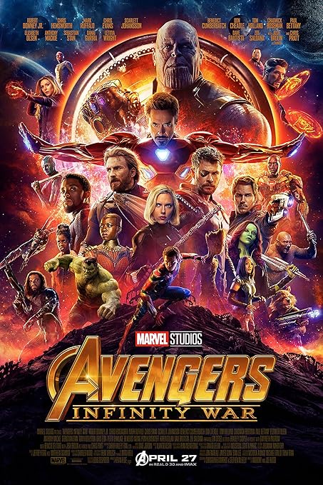
Image result for avengers infinity war posterThe Movie I will be analysing for their poster and trailer will be Avengers:Infinity War.

The layout of the poster portrays the cast of the film spread out across the vertical page. The design consists of an area placement, most likely a place the cast will visit whilst in the film. The lighting is quite bright in some places, likely because of the pure light generated by the characters themselves, such as Iron Man and his blue repulsers, or the antagonist, Thanos, with his glowing infinity stones.

The colours used are very rich, however again, the poster is majorly taken up by the characters and their properties. The background though, consists of the colours purple and gold. This has connotations of dietes, and an idea of the kind of high tier levels of people, that the film will be dealing with. Avengers is a popular title amongst the marvel community, therefore, the font used for the capital "A" is the same in all media it's represented in and it's iconic. For those who are familiar with the series, they would already understand the genre, however through the use of mise en scene, we see weaponry and suits shown and presented, hinting to the audience that it is in fact an action movie. In addition, not one person on the poster is wearing a smile, possibly making a link to something bad within the atmosphere.

The visual codes of this poster take a similar approach to that of LucasFilms Star Wars posters and promotions. This is effective as a frequent place visited within the new avengers film is space, and of course, star wars is based majorly in space, so this was an easy comparative. This marks quality, along with the presentation of the very popular "Marvel Studios" logo. If your eyes are good, you will notice actors such as Robert Downey Jr, Chris Hemsworth, Scarlet Johanson and Benedict Cumberbatch. However they're not mentioned through anchorage, but instead, placed further towards the front, to draw in more of the audience, and consume the majority of concentration upon them.

Mise en scene presents only two characters majorly gifting direct mode of address towards the audience. This two characters are, Iron Man and Thanos, almost the two main protagonists and antagonists within the film. This is effective as it signals to the audience as to who they need to keep their eye on, as their eyes are on us. There is no expert criticism on the poster, as during it's release, it had not aired in theatres as of yet. However, audience expectations would likely be very high, expecting a nice long action packed film, since it's coming from Marvel Studios and they have quite the reputation.

Within the trailer, costumes carry themselves on consistently, as the main costumes were already presented in the poster.

Post Modernism in Life On Mars

Post Modernism is very prominent within the text Life On Mars. intertextuality makes an appearance in the text. It's a massive link to D...